Discover Case Study
Feb - Mar 2024
Evaluated and redesigned Discover’s mobile app to improve navigation, payment clarity, and overall usability.
ROLE
UX/UI Design · Mobile App Design
TOOLS
Figma
OVERVIEW
Discover Bank is an online American bank providing checking, savings, credit card, and loan services to over 60 million cardholders. The app is intended to provide easy access to online banking through managing accounts conveniently and securely.
After evaluating the mobile app in accordance to Neilson’s 10 usability heuristics, there were issues regarding consistency & standards, recognition rather than recall, and aesthetic & minimalist design.
For user-testing, a framework based on these issues were created to conduct additional evaluations with secondary evaluators.
The heuristic evaluation resulted in three recommendations to enhance user experience of Discover Mobile:
Simplify and Clarify the Main Page
Integrate Spend Analyzer and Improve Language
Enhance Payment Transparency
METHOD
Neilson’s 10 Usability Heuristics are guidelines for designers to create and evaluate user interfaces that are user-friendly and efficient to use.
I used each heuristic to test if the system aligns with the app's intended purpose by giving a rating from 0 to 4, with 4 being a usability catastrophe that needs to be fixed.

IV. Consistency and Standards
Rating: 4
Example: Viewing the spend analyzer
Clicking on the spend analyzer icon brings you to a pop-up website to view the spend analysis. This external website becomes a mobile website version of the app and allows the user to perform all of the options available on the app itself. This would be ideal if this function was properly integrated into the app.

VI. Recognition Rather than Recall
Rating: 4
Example: Knowing how much of your monthly statement you already paid off.
The user has to calculate/remember whether they have made enough payments to pay off the last statement balance. The interface should be helping users recognize the amount/total of payments they made. Instead, users have to make an extra effort to recall the amount they still have to pay.

VIII. Aesthetic and Minimalist Design
Rating: 3
Example: “More Page”
There are a lot of information, options, and features on each page/tab that can get very overwhelming. The information is categorized and stored within each subcategory, which might be text heavy since there are no icons.
USER TESTING
Using the three key usability issues, scenarios and tasks were created as a framework for two user interviews.
Meet Crystal

Age: 21
Student at St. Johns University
Used online banking for 3 years
Never banked with Discover
Meet Kevin

Age: 20
Student at FIT
Used online banking for 6 years
Never banked with Discover
While completing these tasks, they were asked to narrate their actions and thoughts using the think aloud protocol. Insights on observations, pain points, and opportunities for improvement for each step of the tasks were sorted into clusters.
AFFINITY MAPPING
Scenario 1: You realize you aren’t getting the notifications regarding your Discover account.
Task 1: View and customize your alerts.

Scenario 2: You want to view the transactions you have made on your Discover credit card.
Task 2: Figure out how much you have spent in January 2024 in the category of Restaurants.

Scenario 3: You are wondering if you have made enough payments to avoid interest for the balance.
Task 3: Make sure you have paid off your last statement balance and make extra payments if needed.

RESULTS
Users spent extra time scanning the homepage before acting, indicating uncertainty about where to begin.
Once users located the correct feature, completing tasks (e.g., modifying alerts, submitting a payment) was straightforward.
The Spend Analyzer feature was positively received for its color coded clarity and easy interpretation.
Filters for transactions worked as intended and did not cause confusion.
Observations
Pain Points
Users struggled to understand the payments page due to lack of transparency and unclear balance information
The app relied too heavily on user memory to track payment progress (how much of a statement balance has been paid).
The main activity screen was visually overwhelming, causing users to hesitate or miss key details.
Important features like “last statement balance,” “recent activity,” and “pay” button were often overlooked due to the overload of information.
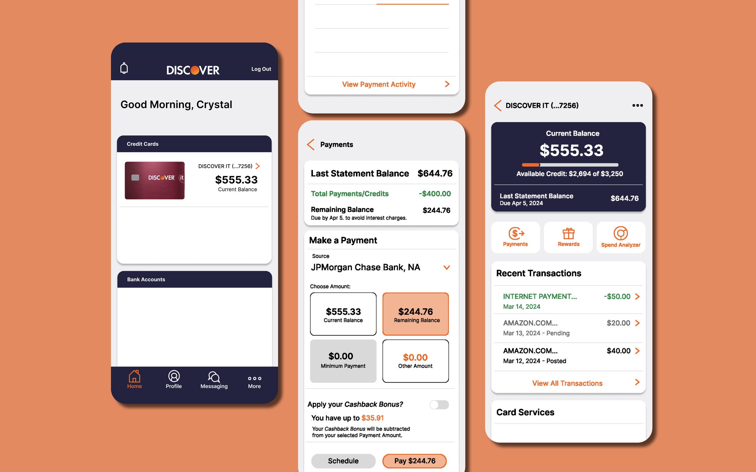
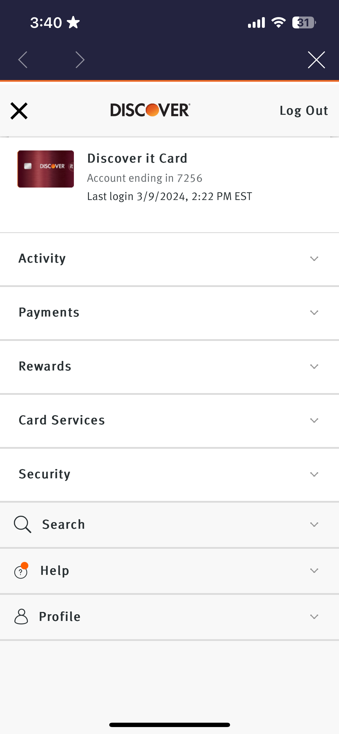
REDESIGN
1. Simplify and Clarify the Main Page
Problem: Overwhelming main page that users may miss features or information.
Recommendation: Make the landing screen more minimal and readable to reduce hesitation and cognitive overload.
Before:

After:


2. Integrate Spend Analyzer and Improve Language
Problem: Inconsistent “pop-up” websites for features and verbiage. This pop-up website format leads the user to another interface (website version) that has all the same features.
Recommendation: Embed the spend analyzer in-app and change “recent activity” to “recent transactions” for greater clarity and user intuition.
Before:


After:


3. Enhance Payment Transparency
Problem: Users struggled to track how much of their last statement balance was paid, risking interest charges and credit score impacts.
Recommendation: Provide clearer, more direct insights into past payments and statement balances.
Before:


After:
